By: Mike Le
Is your website mobile-friendly? 2016 marks the first year that mobile traffic surpassed desktop traffic, yet many businesses have still neglected to take mobile devices into account.
Their websites aren’t optimized for mobile search, and simply don’t look good on phones and tablets. Not only does this cause frustrated users to leave the site, it’s a big problem for your SEO as well.
As of April 21, 2015, Google unleashed “mobilegeddon” which punishes websites that aren’t mobile-friendly, and announced that mobile-friendliness is now one of their most important ranking signals.
How do you know if your site is mobile friendly? The first step is to check Google’s Mobile-Friendly Test tool. Enter your website’s URL, and Google will let you know if your site is mobile-friendly.
Here are five areas you must look at, if you want to succeed at mobile SEO
There are three types of mobile sites: responsive, dynamic serving, and parallel mobile site. Choosing the right model from the get-go is the most important decision you can make regarding your mobile site.
Responsive site: Responsive Web Design is a technique that allows you to show the exact same website, with the same website code, but the site conforms (or morphs), depending on the size of the screen. Sites like Starbucks, The Next Web, Mashable, Boston Globe, Drive Me Safely, and Hot Jobs Myanmar use responsive design.
Many businesses choose responsive website for its convenience, lower cost, quick turnaround, and the ease of maintenance. This approach is recommended by Google. The cons are the less differentiation for mobile UX, and it is harder to apply on big-scale web platforms.
Parallel mobile site: a parallel mobile site is a separate version of your website created specifically for mobile users. A few sites using parallel mobile site are Home Depot, eBay, and The New York Times.
Creating a separate mobile site (e.g. m.yourwebsite.com) will allow you to offer the best customized mobile experience for users without affecting your desktop website. This is most appropriate for large-scale websites.
However, it may double the cost for implementation and maintenance. And it takes advanced SEO expertise to handle the complexity of backlinks and content between web and mobile versions with proper redirects.
Dynamic serving site: In a dynamic serving site, the web server detects and serves custom page that match the visitor’s device in the same URL. A few sites that use this method are CNN, Zillow, and Mico Equipment.
This approach provides a great custom mobile experience and uses the same web URL for web and mobile. However it requires advanced technical expertise and high costs to structure, implement properly, and maintain. It can also confuse users who notice different content on the same page (with different devices).
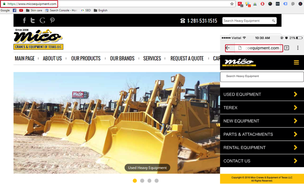
Dynamic serving website – Mico Equipment
User engagement has a big influence on search rankings, so optimizing content for mobile experience is very important. This includes headlines, copy, images/videos, forms, and call-to-actions.
This is critical if you are using responsive websites. In responsive design, the same page content is used on both web and mobile screens. So you should create your web copy with both web and mobile experience in mind, to make sure the content can communicate effectively with users on across multiple screens.
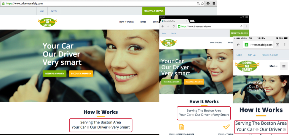
Responsive web design for Drive Me Safely
Regardless of the type of your mobile site, it is critical to optimize for mobile loading speed. Today, Google considers loading speed as an important ranking factor. Slow speeds will impact user experience greatly.
There are a lot of techniques available to improve mobile speeds, here list a few:
In mobile, the SERP real estate is precious and the competition for clicks is fierce. Due to the portrait landscape of mobile devices, only the top two Google results will be above the fold in SERPs. Furthermore, Google often shows maps, algorithmic answers to queries, or related apps directly below (or even above) the first result.
Optimizing your SERP listings using relevant rich snippets and rich cards can help you gain a competitive edge and capture more user attention and clicks.
Meta content
You should write the meta title and meta description tags for web pages that can also fit nicely in mobile SERPs, to improve mobile click-through rate.
This article was first published on SearchEngineWatch
Address: 85 Broad Street, 17th floor, New York, NY 10004
Phone: +1 646-866-7119
Email: info@cbidigital.com
Hours: Mon-Fri 9:00am - 6:00pm
Join our newsletter
Enter your email to get our lastest news & events